Users take advantage of the endless board space that is available in Conceptboard. It allows for everyone to fit all of their concepts and ideas that are inside their heads in one workspace. But sometimes, when you’ve caught the creative spark and you’re on a roll, the endless board makes it easy to get lost trying to capture that rush of ideas. We show you how you can communicate your ideas more effectivley while using Conceptboard.
Don’t lose sight of the bigger picture: once ideas are captured they need to be shared and communicated with others. Take some time to ensure that you communicate your ideas in the best visual way possible.
Communicate your ideas by structuring them better
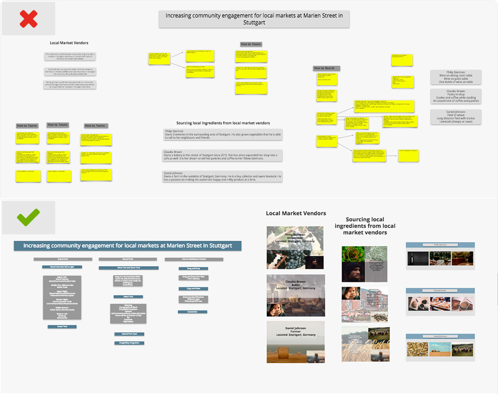
Not only does using headlines and text boxes bring organization in your boards, it also makes it easier for your audience to read all information. So make sure to keep all text within your text boxes as simple and to the point as possible.
Use sections to separate your information throughout your boards. Within each section, create headlines and text boxes to further organize each section. Make sure to use short headlines with 3-5 sentences under each, to not overcrowd your boards.
Give your Ideas Space to Breathe
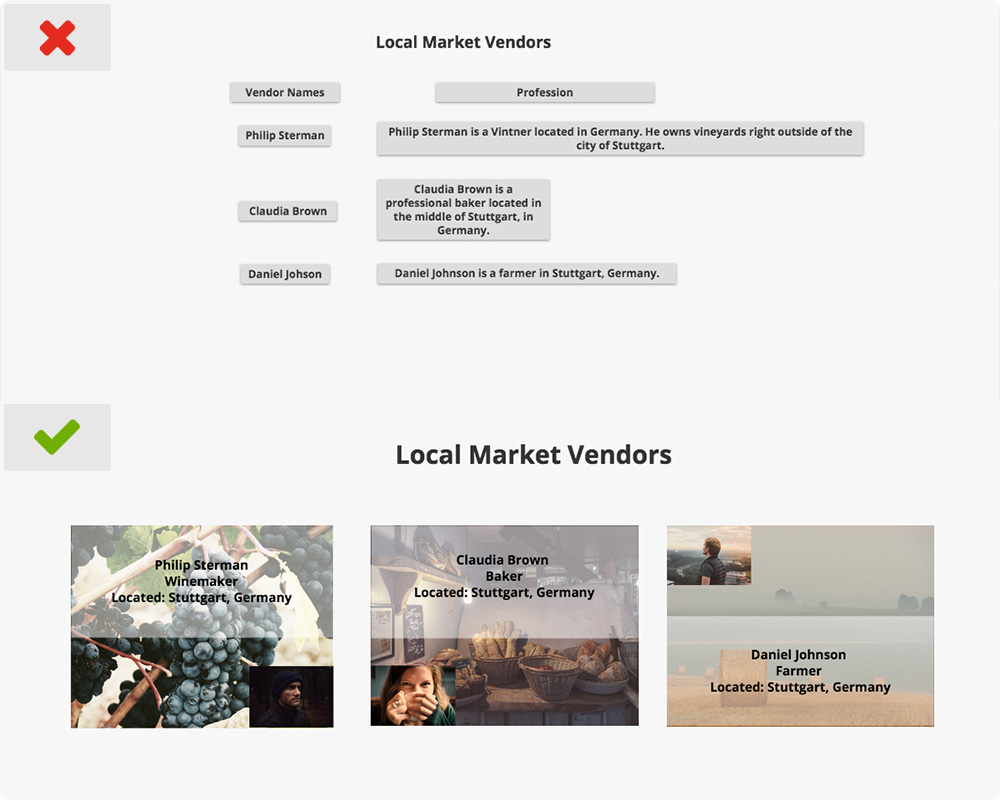
Each sentence should be no more than a few words long. Your audience will lose interest very quickly if they have to read paragraph upon paragraph of text. You can create separate text boxes for each sentence or space your short sentences out. The more space between each sentence, the easier it will be to read.
In some cases, you can also highlight key words in your sentences to emphasize what the section is about. For example, if you are talking about a specific person, only highlight their name, their occupation, where they are from, etc… Full sentences are not needed in this context.
Size Does Matter, Watch your Font Size!
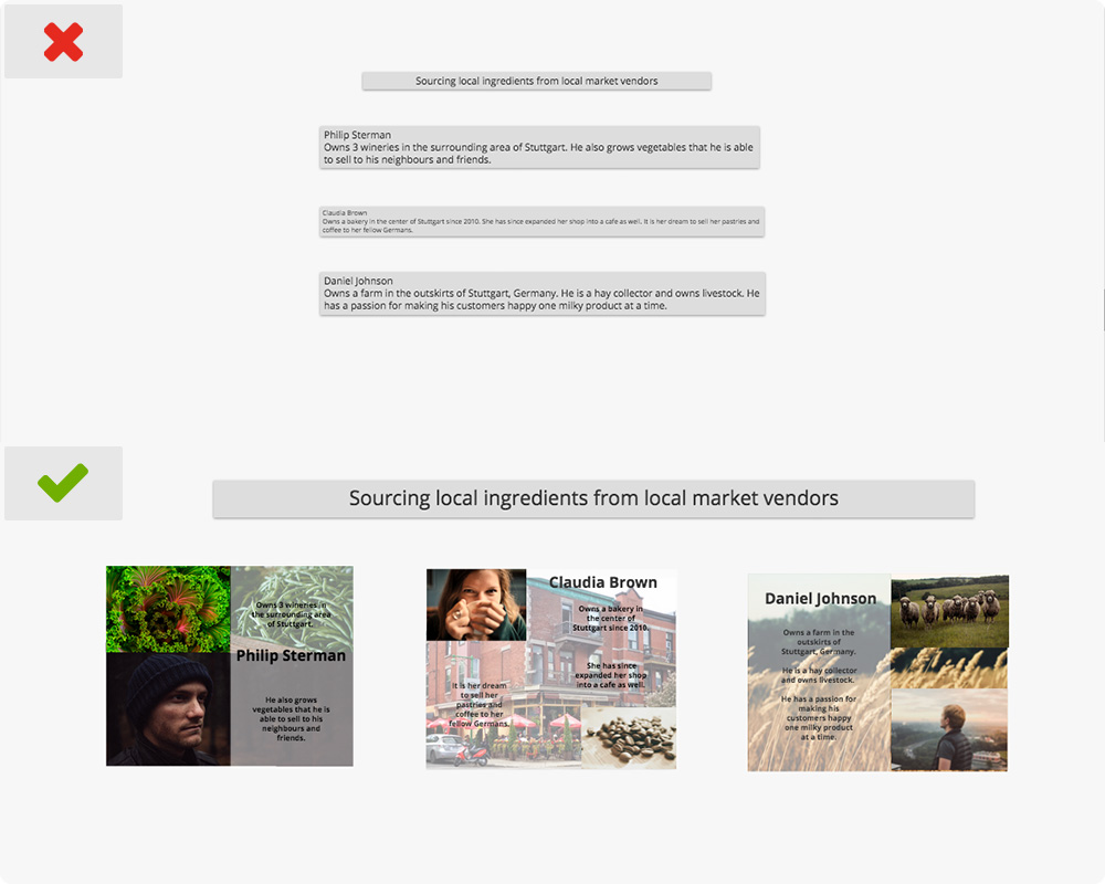
When adding text to your boards, make sure the font is big enough for your audience to see. You must remember that they will not always look at your boards in 100% zoom, so have bigger fonts for all key concepts to help see an overview of the important facts. Then, choose a smaller font for all the details as your audience zooms into each section.
Don’t be Color Blind when you communicate your ideas
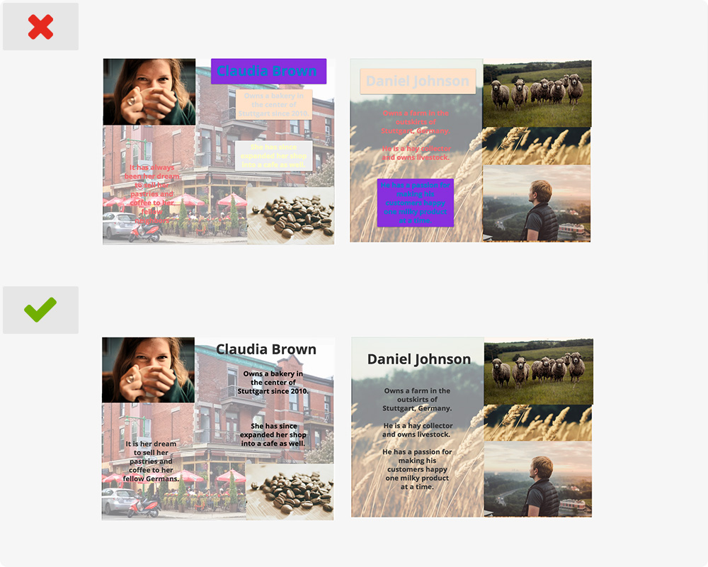
Take notice of the different colors that you use in your text and the background of text boxes or headlines. It is best to stick with 3-5 colors that complement each other throughout your boards. Too many colors will be distracting for your audience.
If you choose a dark color for the background, then select a light color for your font, and vice versa. This will help make the font stand out more. You can also choose to make the background of your text boxes or headlines transparent, which can be more visually appealing.
Strengthen your Ideas with Visuals
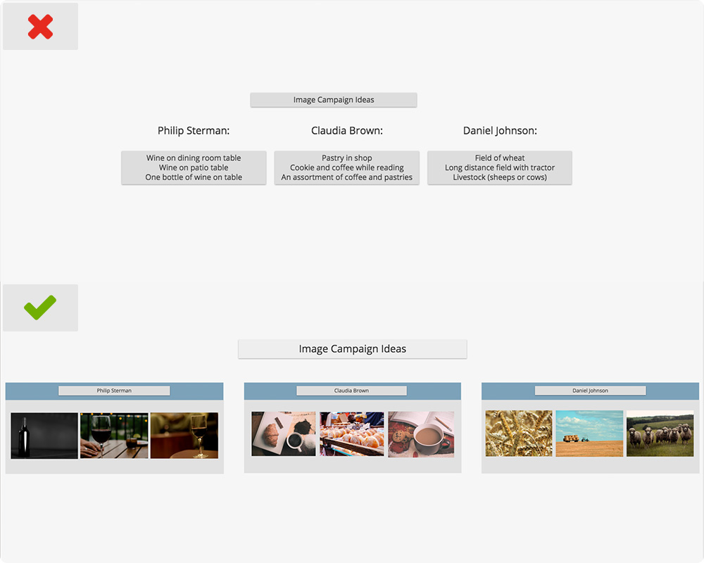
When presented with visual images, people will remember 95% of what they hear and see.
Since it is easy to work directly on top of your visual content in your boards, it is best to have more visuals than text. Insert images behind your text to help reinforce your point and keep your audience engaged in your presentation, giving their eyes a break from reading only text. All inserted content will automatically be inserted in your board outline.
You can add graphs or images, find free image sources here, to help build your presentation.
More tips on how to communicate your ideas
- Always stay consistent throughout your board. Keep the same theme, colors, font, headings, and layout for everything. Using different fonts and colors can be distracting.
- Inserted visual content should be nice and clear, not blurry.
- When presenting your boards, press the down arrow on your keyboard to go from item to item in your board outline. Note: your board outline does not need to be open to navigate to each item.
With a few basic guidelines and liberal use of sections to organize your boards, you can increase the impact your ideas have and illustrate concepts in the board in a way that isn’t possible in slide-based tools. What are your tips for setting up boards?


